Tauragė 2023 - Lithuanian Capital of Culture
ABOUT THE CLIENT
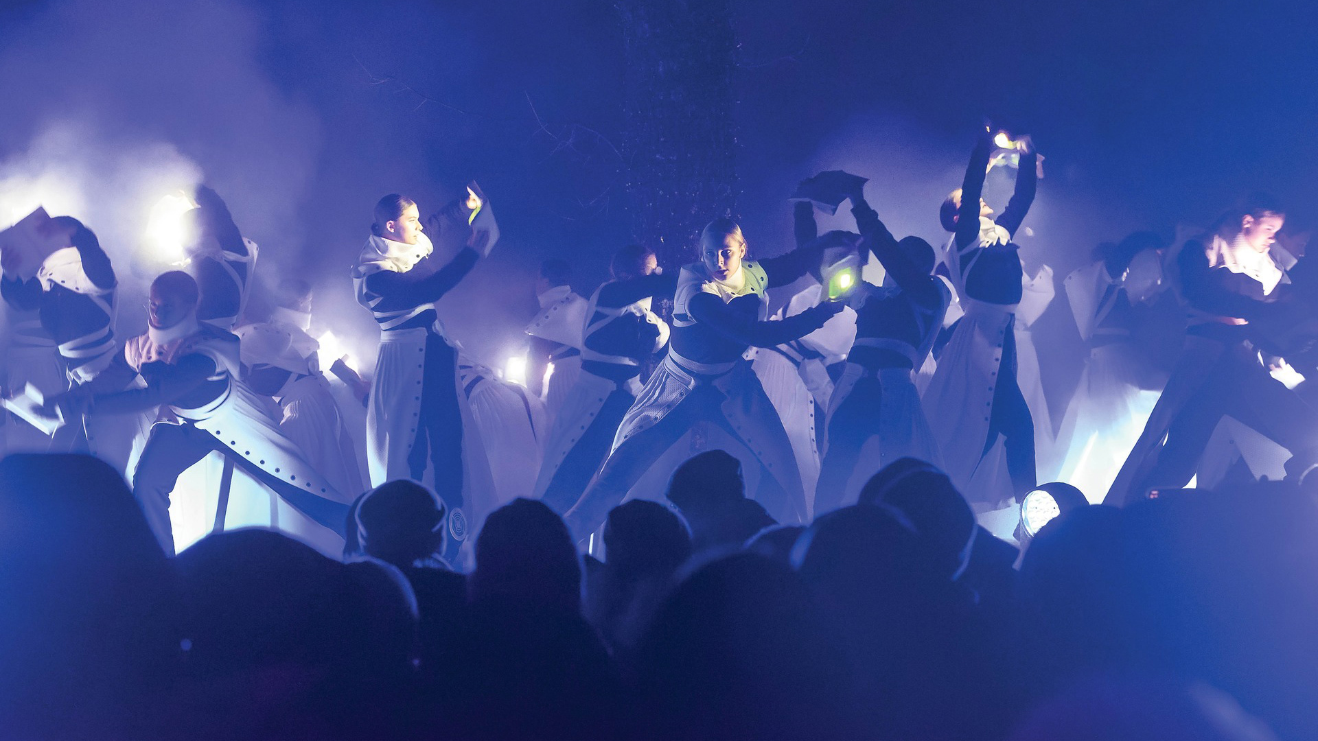
Tauragė 2023 - Lithuanian Capital of Culture was a year-long cultural initiative built around the theme “Customs of Culture”, presenting Tauragė as a city shaped by movement, exchange and openness. The programme connected the city’s history, borderland identity and cultural routes with contemporary community life, creative youth and new cultural experiences, inviting residents and visitors to explore the paths of the past, community, world, future and green transformation.
DELIVERABLES - LOGO DESIGN & VISUAL IDENTITY SYSTEM
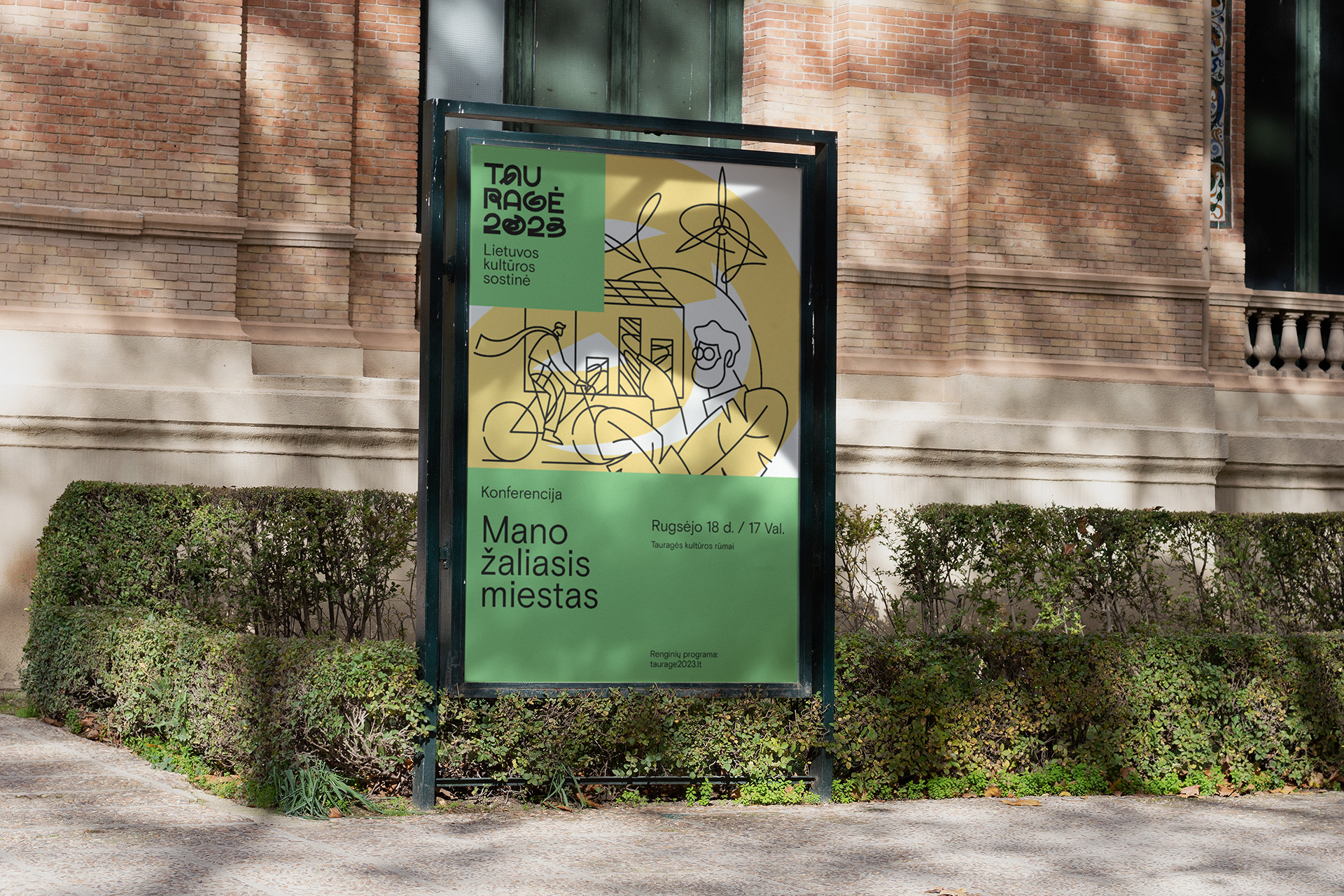
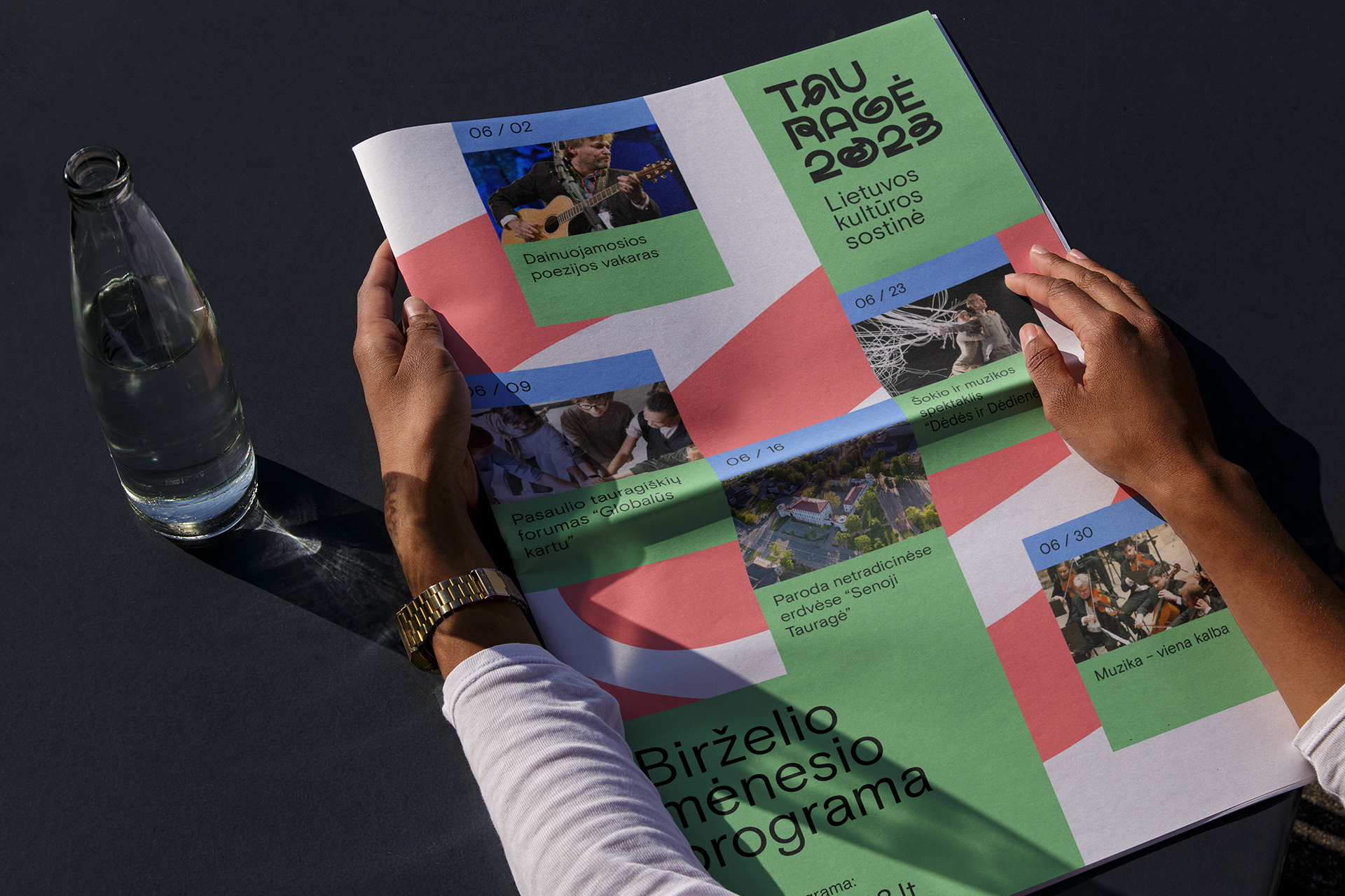
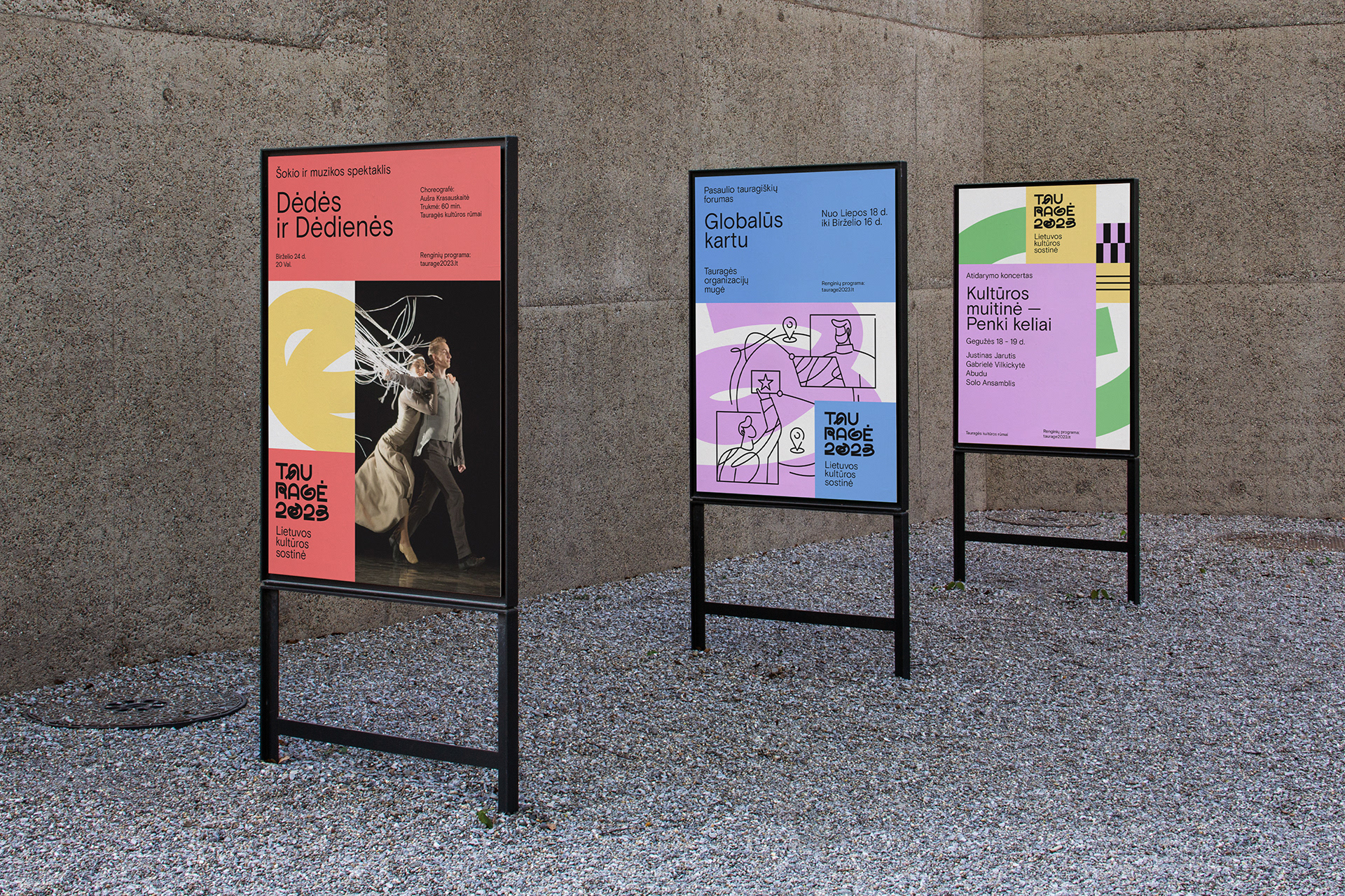
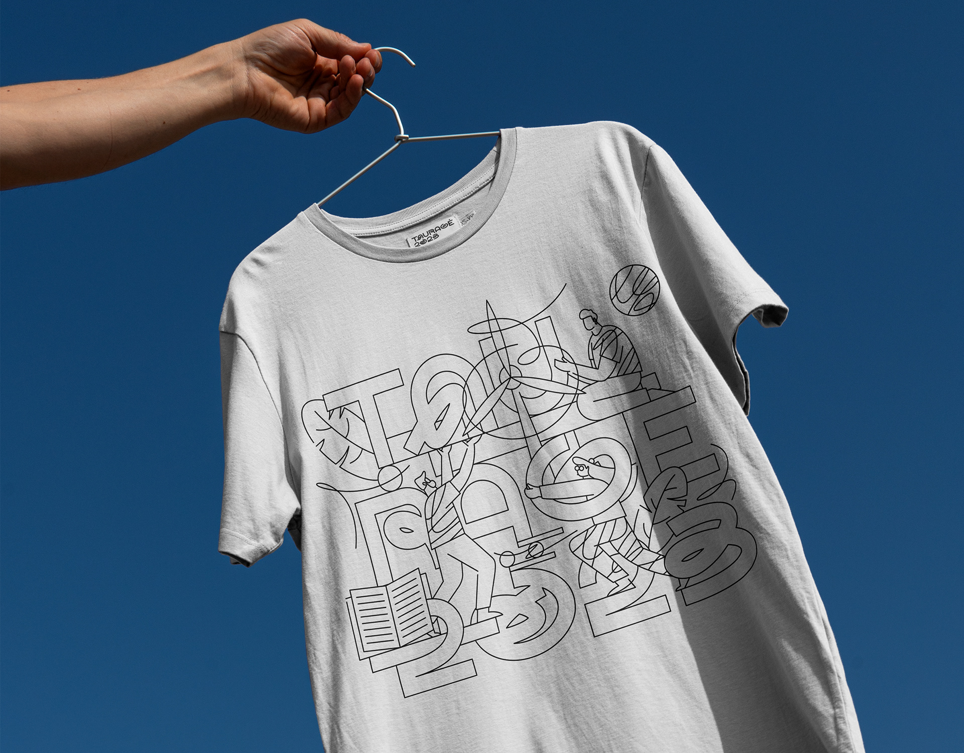
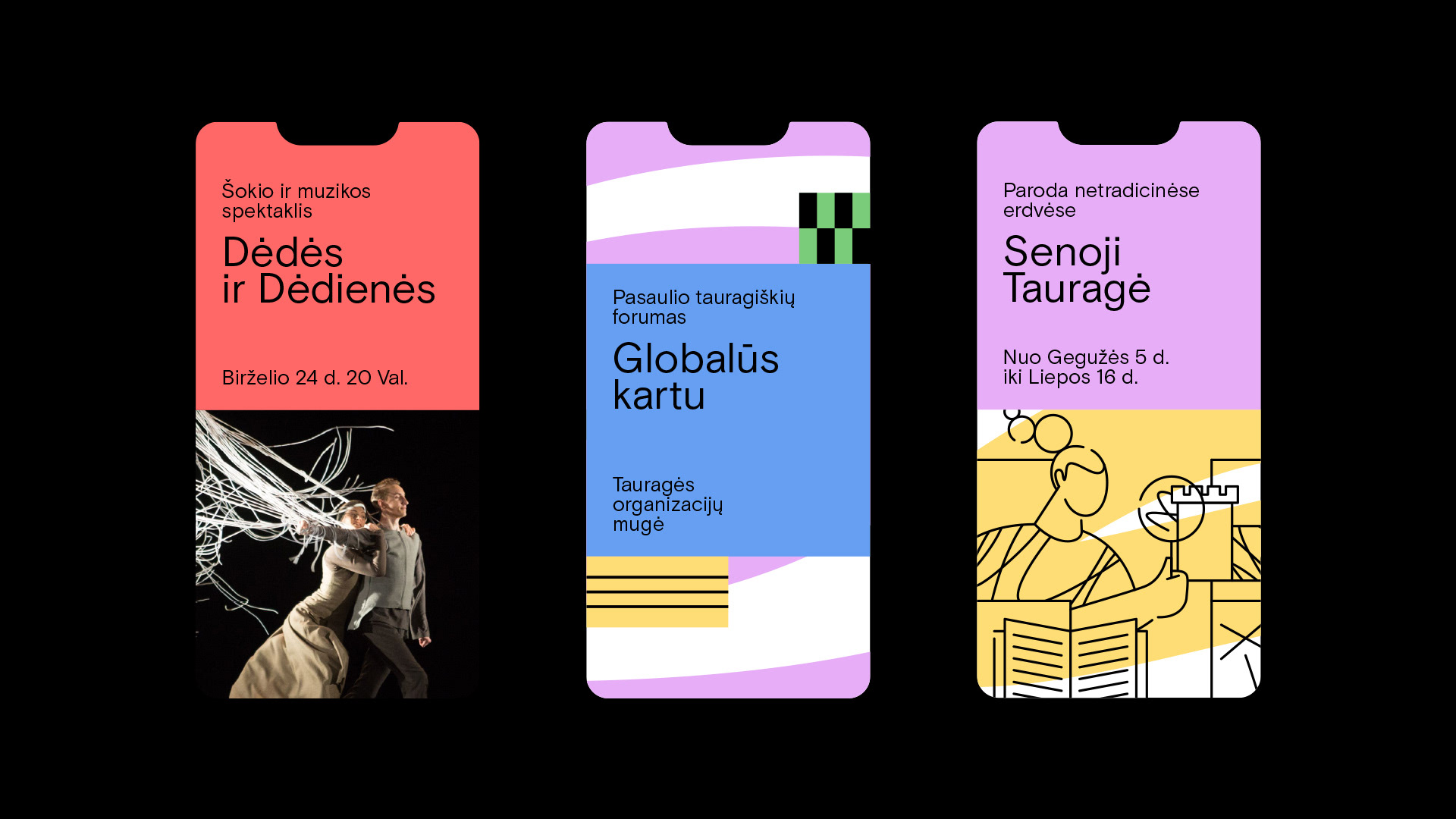
The logo and visual identity system were created to translate the idea of cultural movement, crossing paths and shared experiences into a flexible and contemporary visual language. Dynamic compositions, directional forms and adaptable graphic elements supported a wide range of communication needs across events, campaigns, digital channels and printed materials, while maintaining a consistent and recognisable presence throughout the cultural programme.
SECTOR: CULTURE / PUBLIC SECTOR / CITY BRANDING / EVENTS / COMMUNITY / EDUCATION
SERVICES: LOGO DESIGN / VISUAL IDENTITY SYSTEM / VISUAL IDENTITY ASSETS / CAMPAIGN VISUALS / SOCIAL MEDIA TEMPLATES / EVENT COMMUNICATION / PRINT DESIGN / ART DIRECTION
© Aivaras Bakanauskas
LOGO & VISUAL IDENTITY
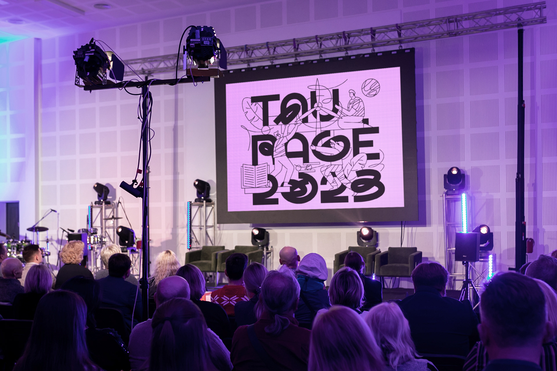
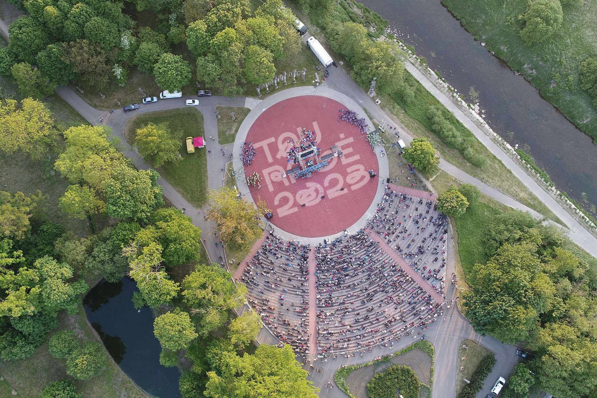
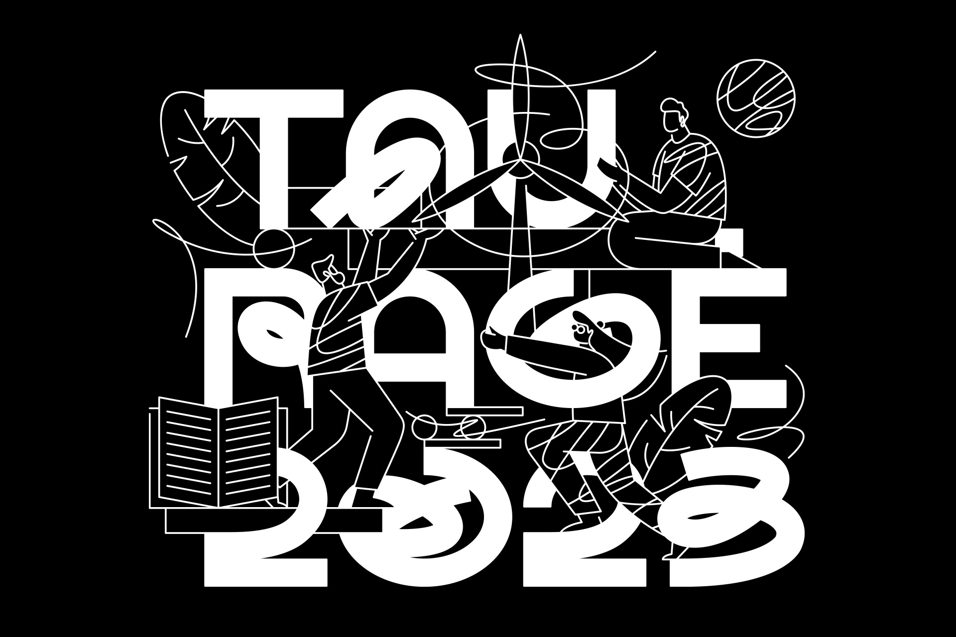
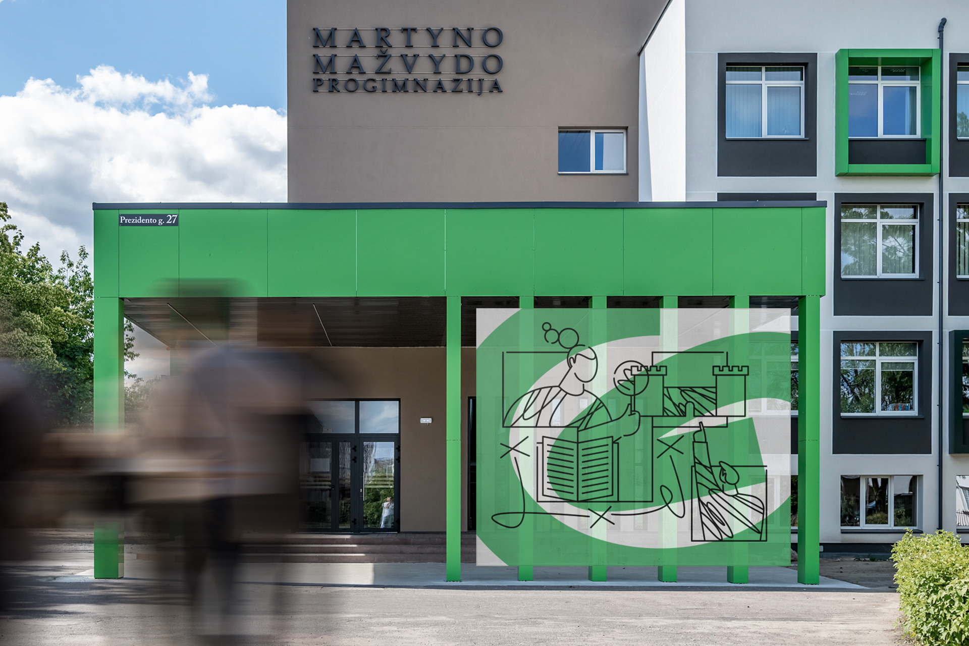
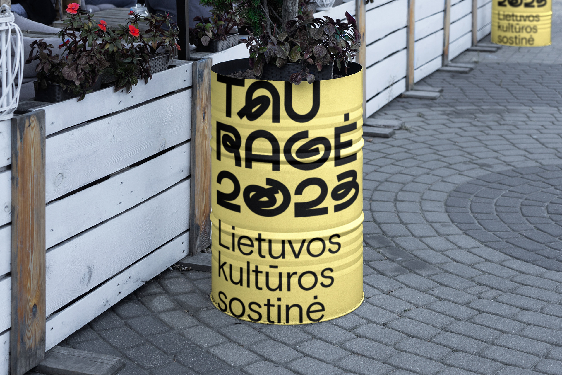
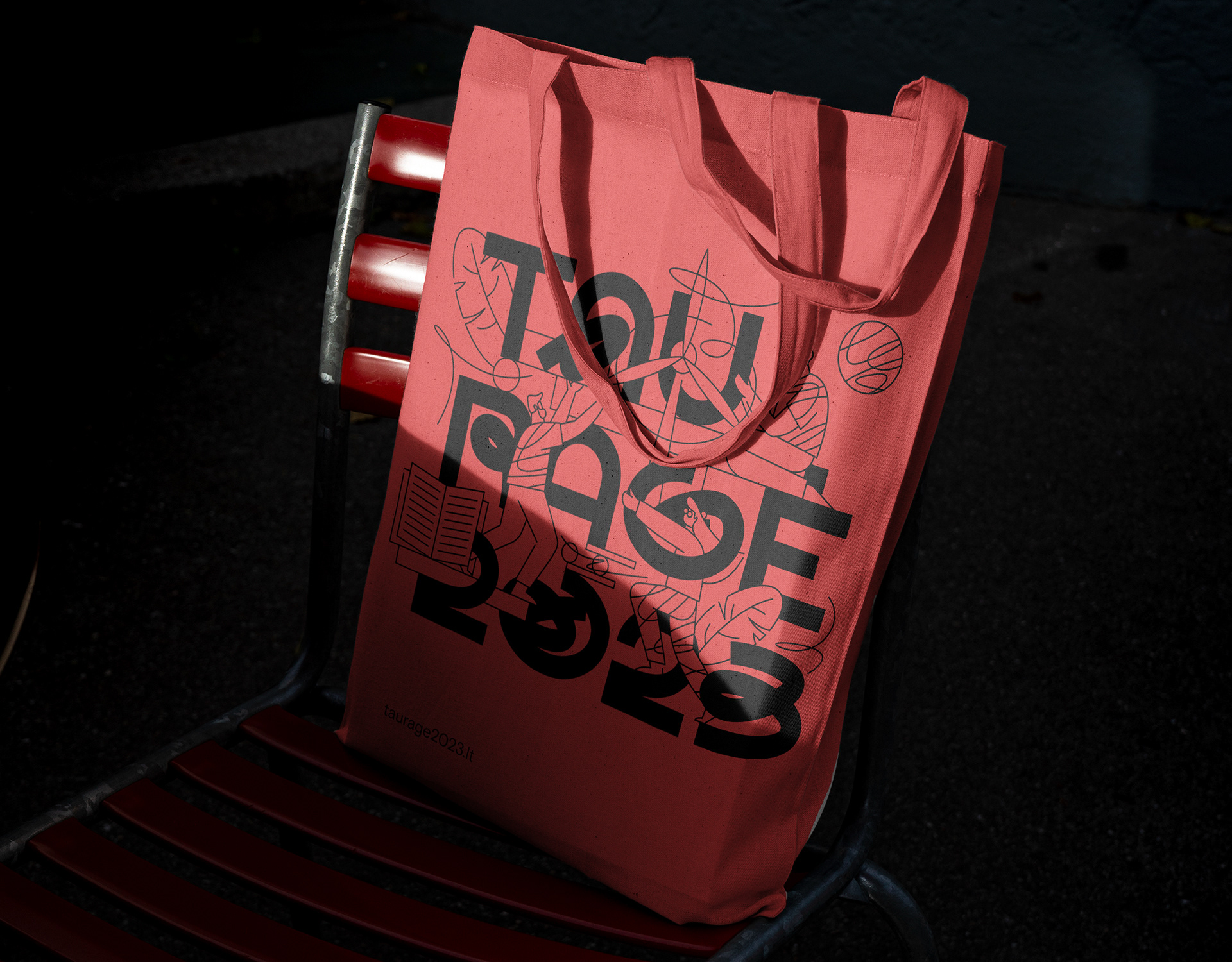
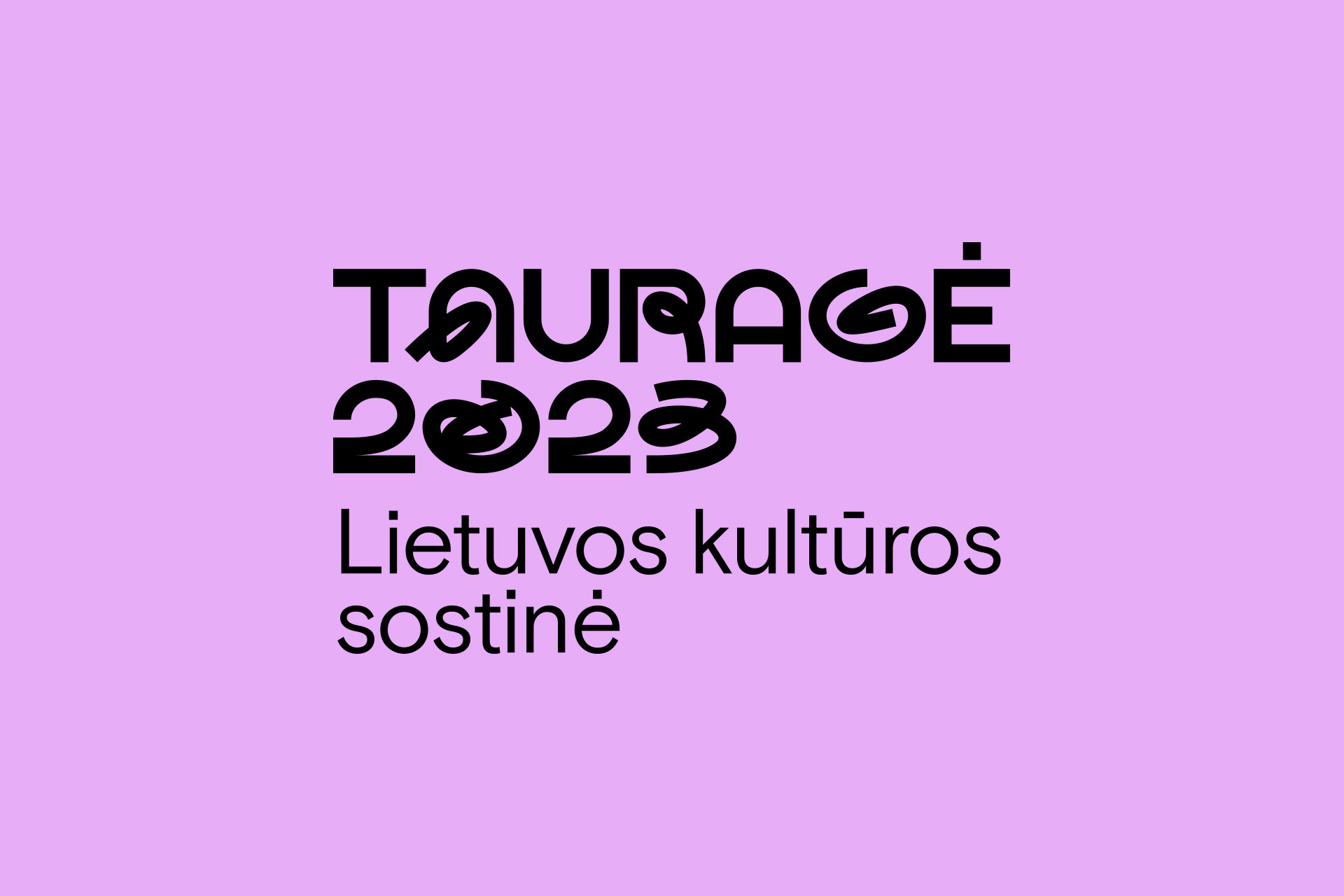
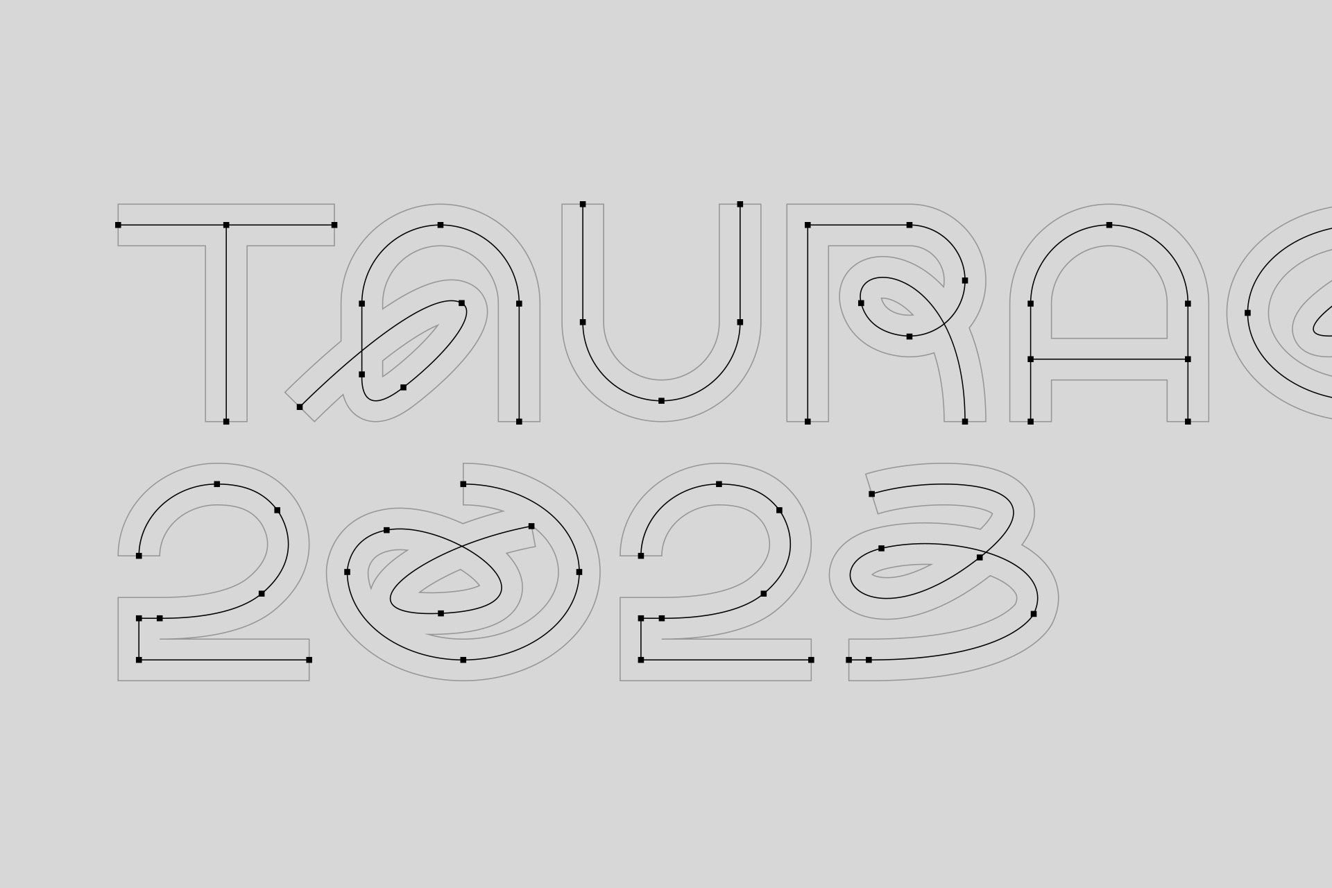
The logo is made up of 5 stylized letters and numbers representing 5 different paths: past, fellowship, world, future and the green path. All these paths in minimalist expression have their own different twists and different character, which will be revealed even more widely in the visual identity.
5 different roads integrated into neat typography symbolize integration into the modern, innovative city of Tauragė, freedom and departure from regular and strict forms. All this gives the capital of
culture freedom and creative directions for new discoveries and fellowship.
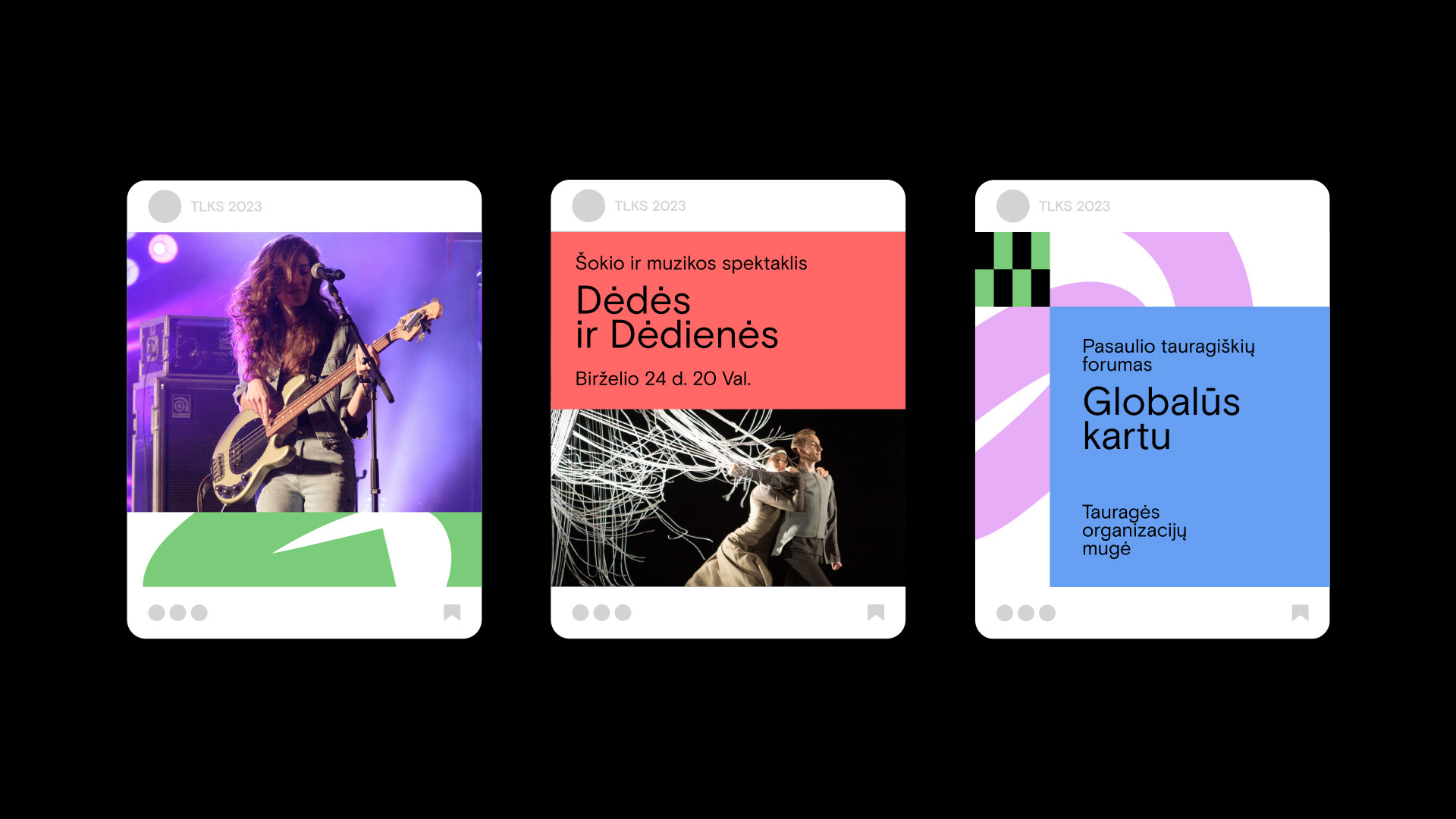
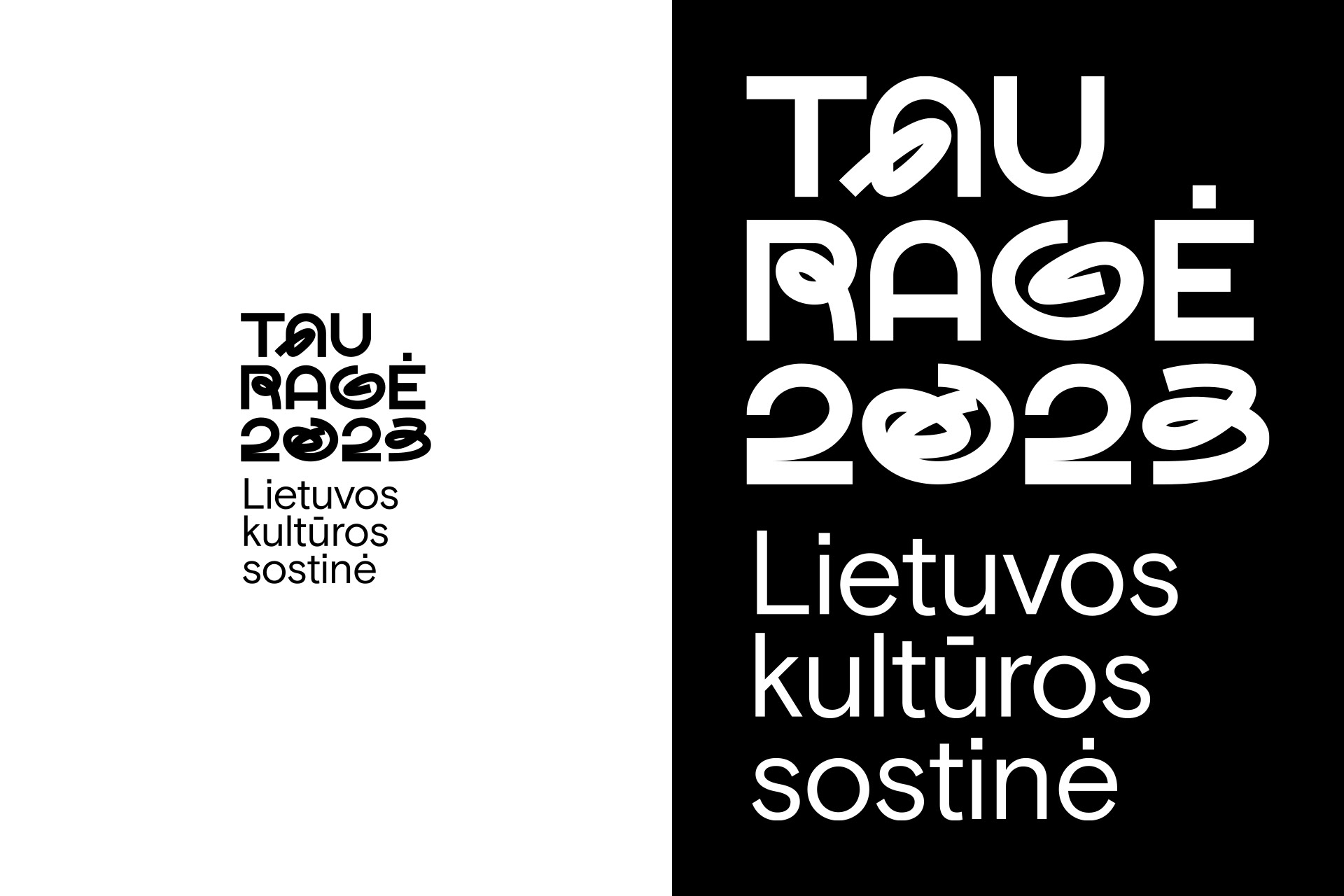
The graphic language concept symbolizes urban community, integration into 5-way development and creative freedom. Communication tools convey the integration of 5 different paths and
the continuity of the graphic language and logo concept. All communication tools perform their
function by allowing easy creation of new versions and prioritization of textual information.
5 different roads integrated into neat typography symbolize integration into the modern, innovative city of Tauragė, freedom and departure from regular and strict forms. All this gives the capital of
culture freedom and creative directions for new discoveries and fellowship.
The graphic language concept symbolizes urban community, integration into 5-way development and creative freedom. Communication tools convey the integration of 5 different paths and
the continuity of the graphic language and logo concept. All communication tools perform their
function by allowing easy creation of new versions and prioritization of textual information.
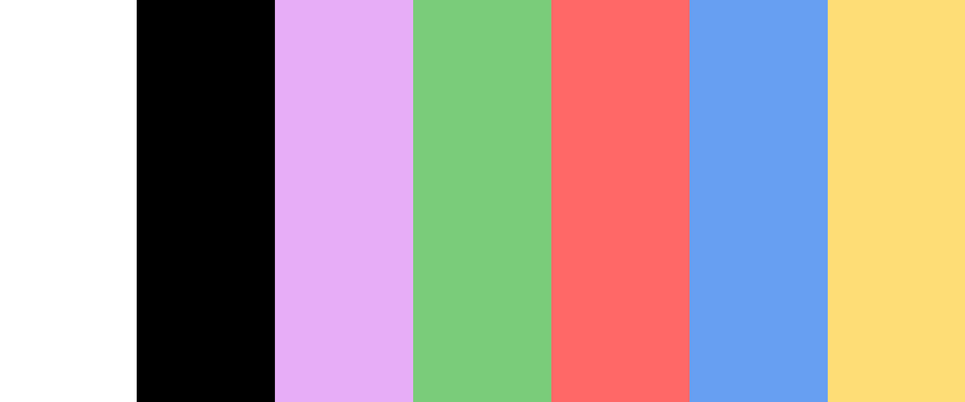
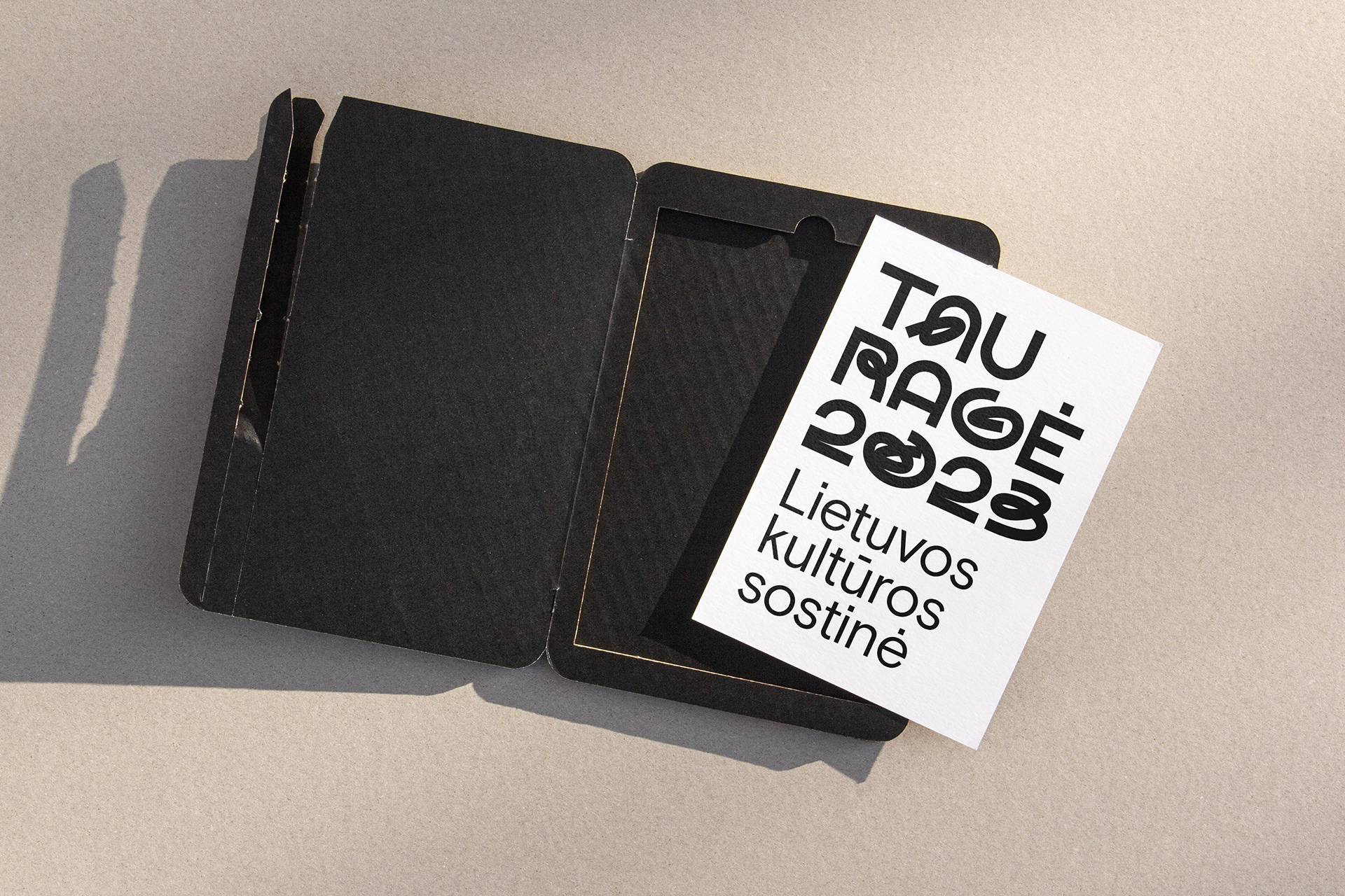
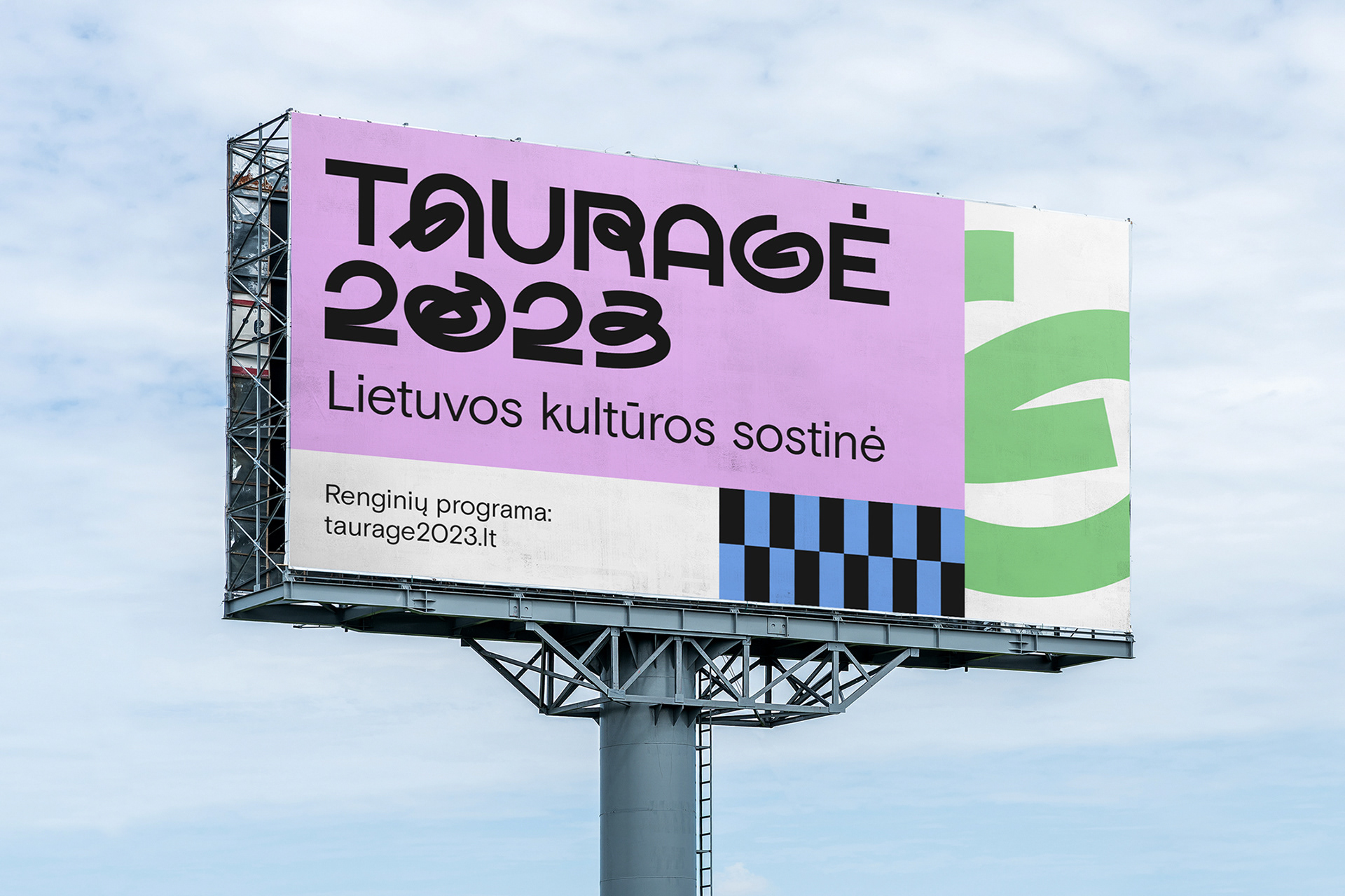
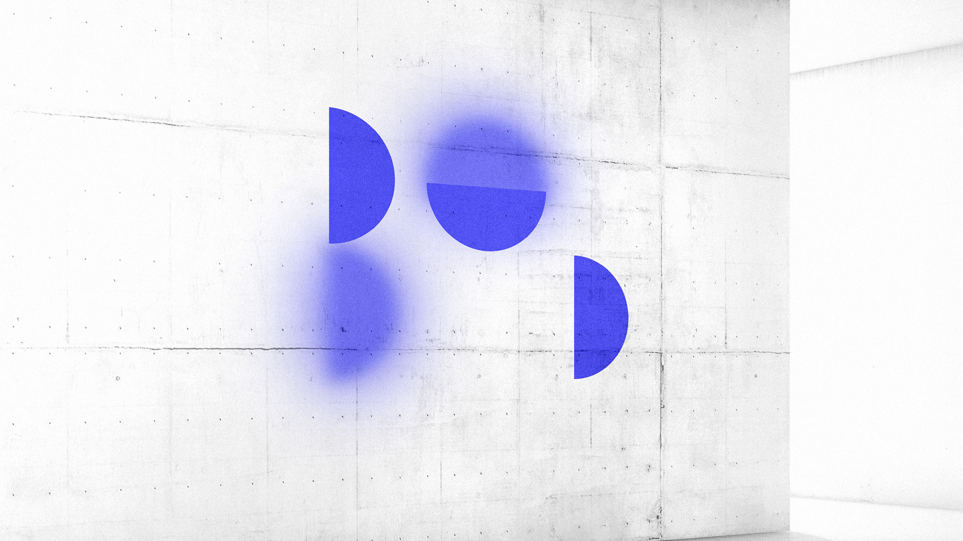
LOGOTYPE
Logo has two variations. One variation for different format usage and small sizes. And the other (main) logo with bright & blur principle on the semicircles. The blur (out of focus) effect and color transitions are used to visualize this idea in all the visual identity.
Logo has two variations. One variation for different format usage and small sizes. And the other (main) logo with bright & blur principle on the semicircles. The blur (out of focus) effect and color transitions are used to visualize this idea in all the visual identity.